Decorating a house is hard work! It is even harder when you aren’t sure where to go with your design. Use these tips to avoid design mistakes.

1. Too Many Photos
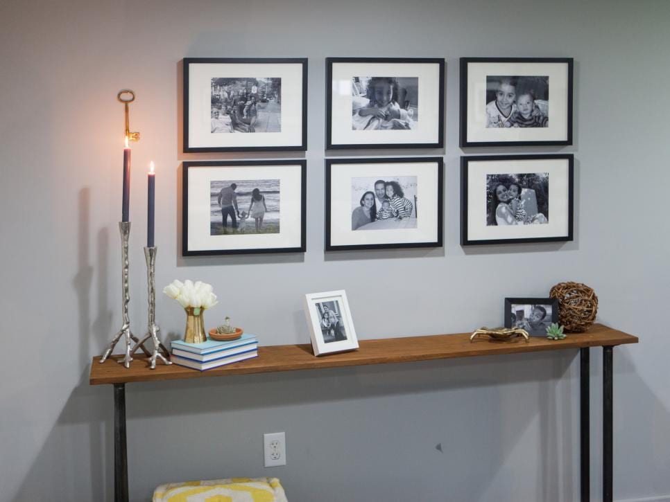
Don’t have an overload of photos on your mantelpiece or end tables. People often have a hard time looking at the photos, because there are so many of them! Instead of displaying them on a table, turn your love of photos into a small gallery wall. Change out the photos as often as you’d like!

2. Avoiding Your Entry Way
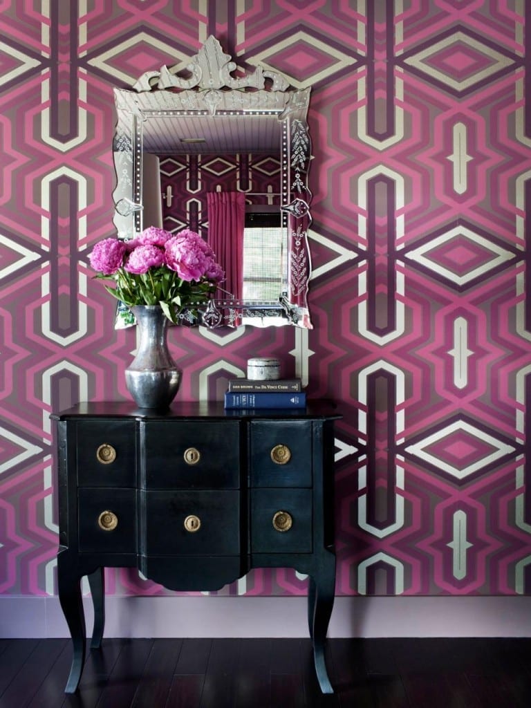
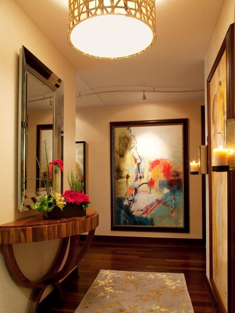
Most people avoid decorating their foyer. Although it is pretty intimidating, it doesn’t take much to make your foyer something unique. Add some patterned wallpaper or a painting to your entry way to brighten up the space and to make a dramatic statement.

3. A Tangle of Cables
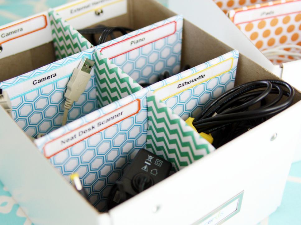
A knot of tangled cables is both a decorating mistake and a safety hazard in regards to your home. Organize your cords in a fashionable and functional storage box.

4. Too Much Print
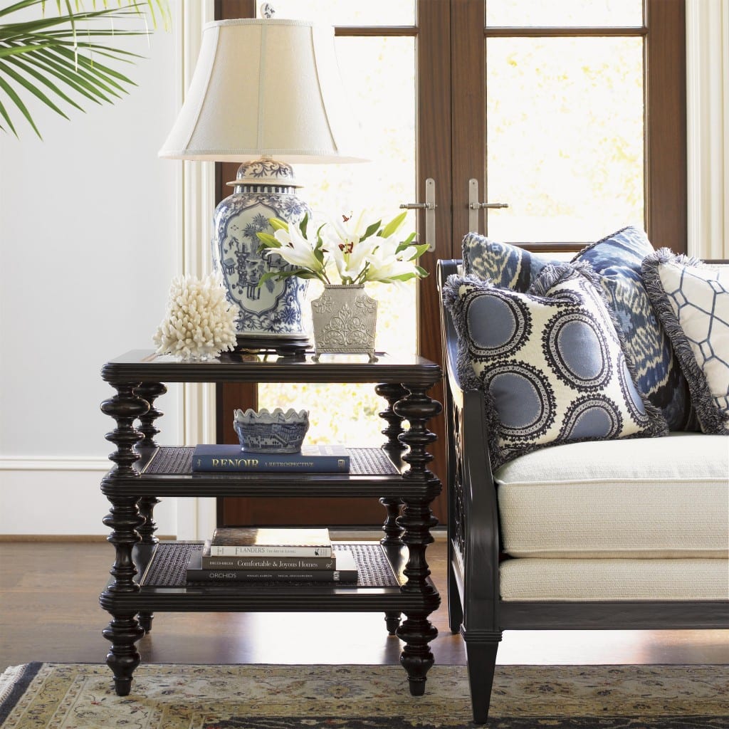
Too much of the same decorating print can overwhelm your home and make it look tacky, two things that no homeowner is going for! Instead of a print overload, choose a few accent pieces to highlight the furniture and existing decor in your home.

5.Old Accessories and Hardware
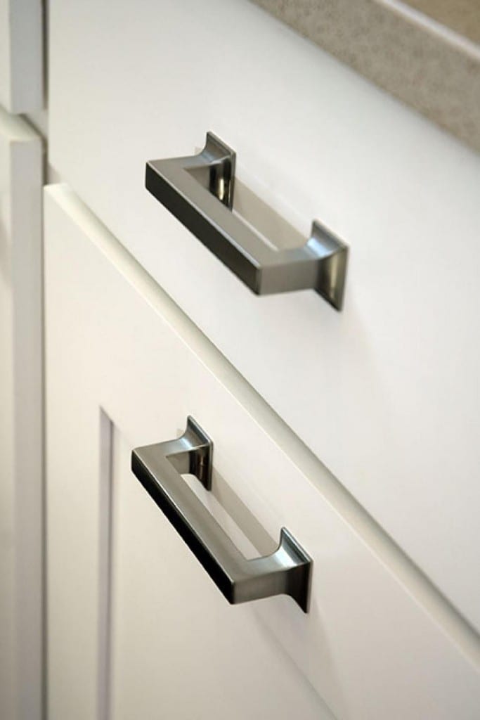
Old furniture hardware can make your home look outdated and old. Replace any old furniture hardware for a new look. You will be amazed at the difference something this simple makes!

6. Poor Furniture Choices
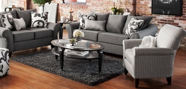
Some people don’t have an eye for arranging furniture, and that’s okay! If you feel like you may be guilty of poor furniture arrangements, look at a magazine for help. Pick a piece that is made of glass (such as a table!) and a lamp to help draw the eye upwards. Arrangements like this help to keep the room looking balanced.

7. Hanging On to Disliked Items
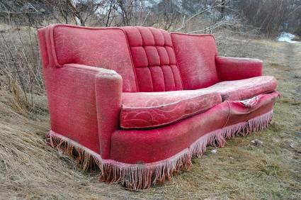
If you are hanging on to a dreaded piece of furniture, or a end table you hate, get rid of it! There is no sense in trying to work it into your beloved decorating scheme. Donate any unloved pieces to friends or to a local thrift store. Chances are, someone somewhere will love it.

8. Taking Formal to a New Level
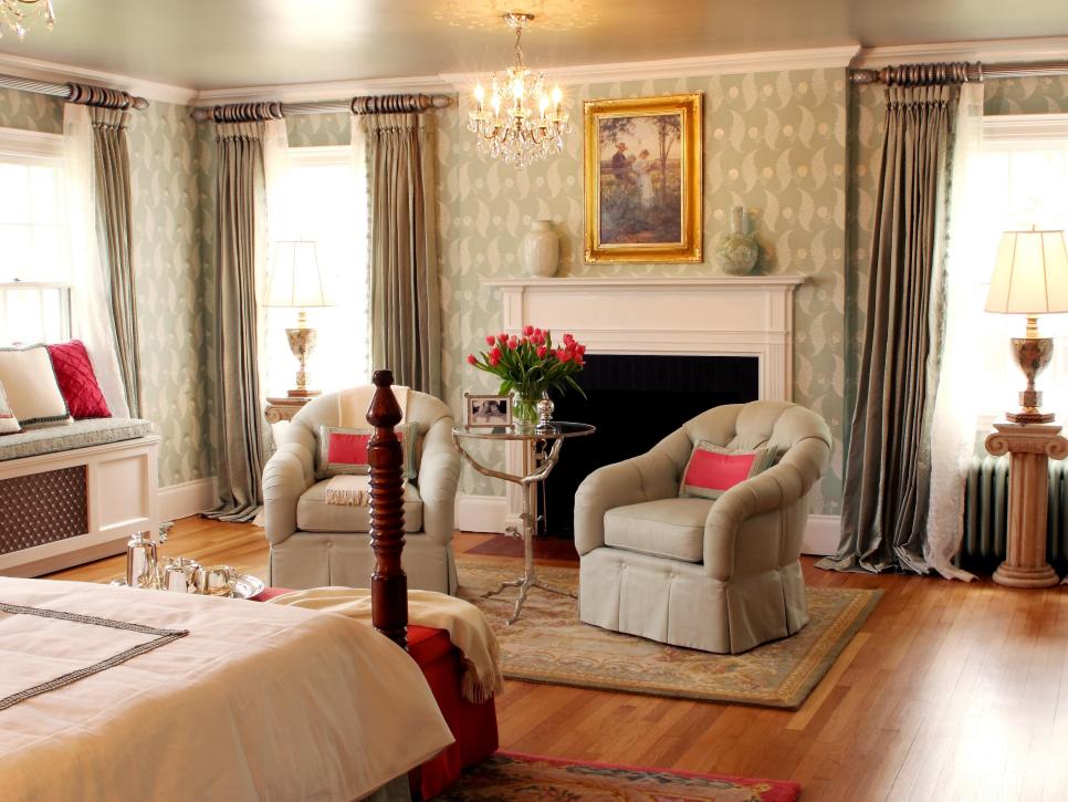
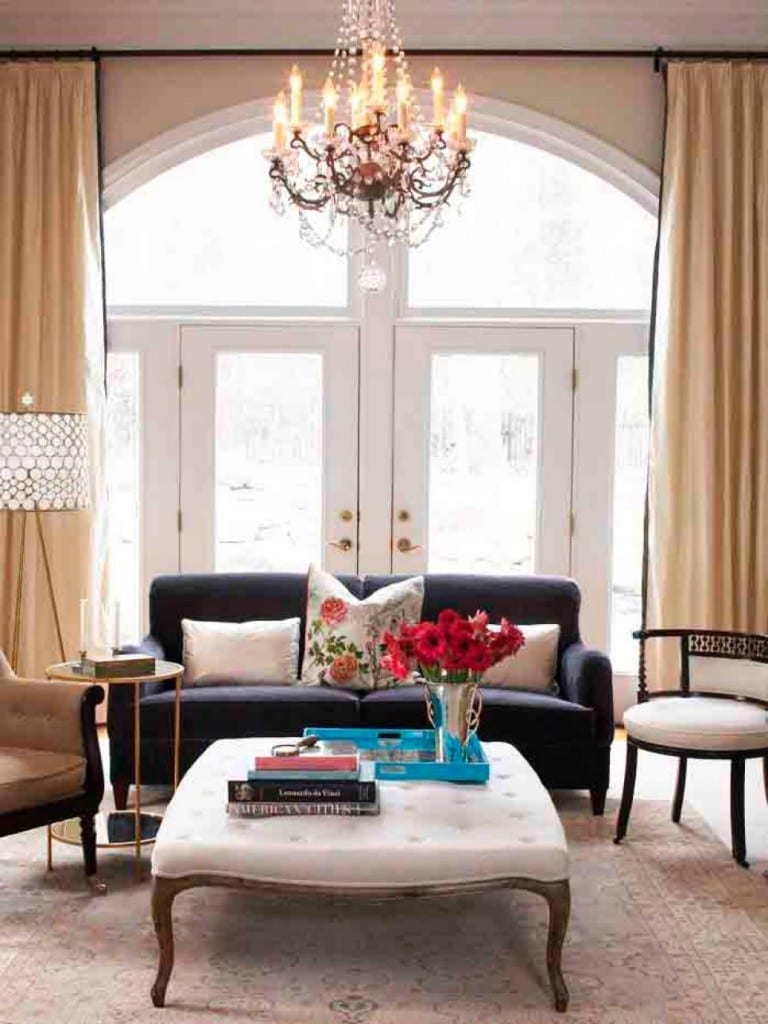
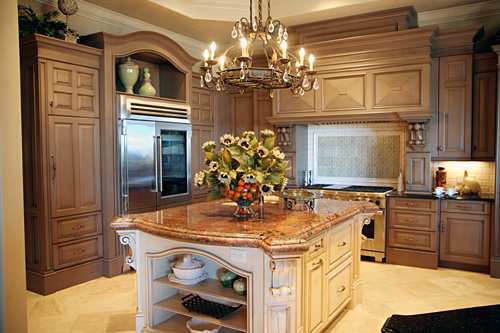
While a formal living room isn’t necessarily a bad thing, it definitely can be when formal is taken to an extreme. An overly formal living room can make your guests uncomfortable. When designing a formal room, it is important to give the room a function, to make it elegant, and make sure that everyone feels welcome. The contrast between the couch, tables, and chandelier of the picture below is doing an excellent job of that.

9. Awful Dining Table Chairs
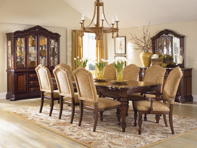
Uncomfortable furniture should be banished from your home, especially those wooden dining chairs! They look outdated and awful, and they are just as bad to sit on. Purchase chairs that are built to last and built to sit on for long periods of time.

10. Clutter
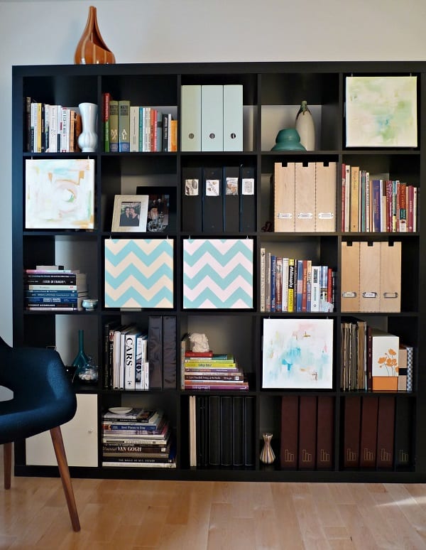
This is a given, visible clutter can make even the most organized home look like an absolute mess. Create hidden storage systems with a bookshelf and some storage baskets. You will be amazed at all of the storage this provides!

11. Too Match-y
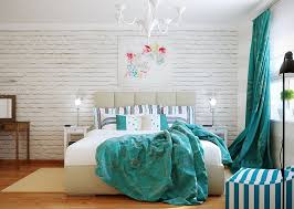
It isn’t necessary to match your bedroom decor seamlessly. A room wrapped in pink could definitely be considered a bit much, and look too much like a showroom. When decorating, it is important to make your room feel lived in, and loved. Pick accents that draw your eye in. Simple throw pillows and some curtains could do the job nicely!

12. Following the In-Trends
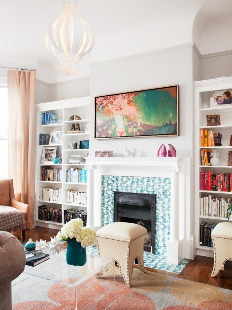
Picking items like lava lamps, beanbags, or similar items can be a huge decorating mistake. Items like these are difficult to get rid of, and even harder to make look good in a room! Pick a style you love and stick with it, you won’t grow tired of your space as quickly!

13. Too Big Furniture
Picking furniture that is too big for a space is a huge mistake. Before shopping, measure your room to pick out furniture that is the correct size. Draw a layout to avoid moving furniture around the room. Remember, less is more!

14. Too Many Different Patterns
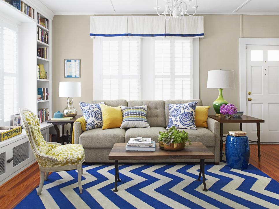
Much like a previous tip, an overload of pattern is never a good thing. Especially when it is too many different patterns. Pick a favorite and use it as an accent piece.

15. Random Rugs
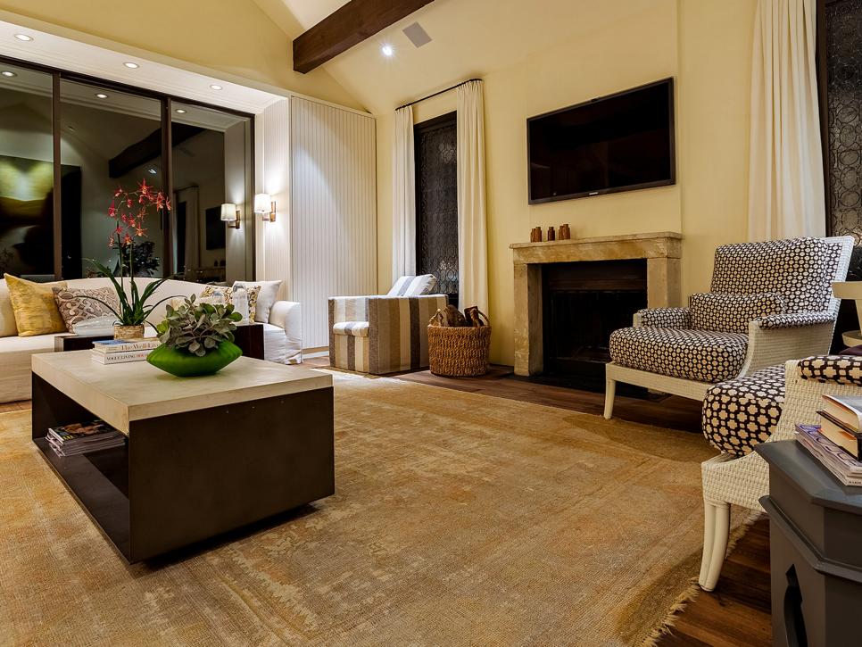
Having a randomly placed rug in the middle of a room can make things look disheveled. Pick a rug that touches all furniture throughout the room. A rug should always touch all the furniture in the room.

16. Bad Lighting
Different times of the day require different kinds of lighting. Lighting that is too bright can make the room look small and overwhelming. Install a dimmer switch on your light switches, that way you can change the lighting as the day goes by. Choosing functional lightning is just as important. Really think about what you want the lights to do in your space!

17. Poorly Hung Frames
Don’t strain your neck to see your photos! If you develop a kink in your neck looking at your frames, they’re hung too high. Be sure to hang your artwork and photos at eye level. Typically, the top of your frame (depending on the size) should reach the top of your door frame.

18. Couch Covers
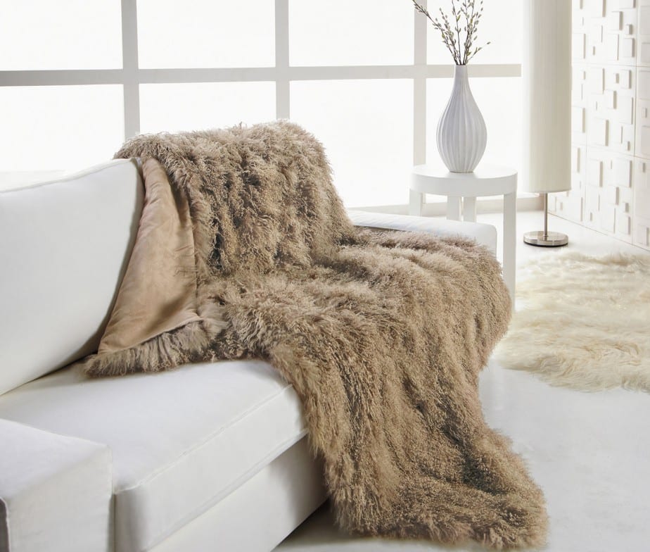
We get it, you love your couch and will do everything to protect it. However, don’t cover it with an awful plastic couch cover! Use a cool throw blanket instead. It makes a statement and doesn’t hide your couch.

19. Pushing Back Furniture
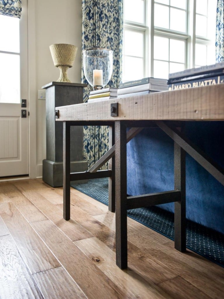
Pushing your furniture back against the wall can make your home look too uniform, which is never a good thing. Drag your furniture away from the wall and use a sofa table as an accessory.

20. Bare Windows
Leaving windows bare doesn’t make your home look better. Window treatments are a great way to change the look of a room without spending too much money. Hang curtains two inches beyond the frame of the window.
